Dynamic Documents with RMarkdown #
If the last chapter was the heart of the plaint text paradigm for research and writing, this is the vital life force flowing through that heart: making sure that your arguments are rendered beautifully in a document that can readily prove to others that you conscientiously executed good social scientific research. We are going to approach two very exciting topics: the first is creating dynamic documents with RMarkdown. The second is creating beautiful and reproducible figures. This processes go hand in hand and we are going to be using the latter as a use case for the former. That is to say we are going to use figure creation to learn why and how to use a dynamic document format like RMarkdown.
To learn the principles of good figure design and how to actually make figures in R with ggpplot. You can follow along with the source code that generates a nearly identical document as this in the pwg-template repo we downloaded earlier, in the example-rmarkdown directory. If you follow along, you are going to be interacting with the document and running some code. After running through the document we are going to be rendering to PDF but along the way we are working in what is called the source file, the .Rmd file. Before moving on to how to do these things I want to get clear on what precisely we are talking about, and then why you should use these tools. I have spared few opportunities to evangelize for the plain text way of doing things but I do think the logic of using something like RMarkdown does require some further explanation.
What is RMarkdown #
I called RMarkdown a “dynamic document format” which might have been confusing on first pass considering documents aren’t static things as we are composing them. That is certainly true, but the information contained in them is meant to remain the same once we are done working on them. The dynamic part comes in the extra bells and whistles that are in the document. RMarkdown and other similar formats (Sweave for LaTeX, jupyter for Python) allow you to embed code along with the prose of your document which means that you are able to keep the means by which you produce your model outputs, tables, figures and diagrams right along with the actual argument. It isn’t just that the code is written in your document (in fact you often don’t want that) but that the code is included to load data, manipulate it, create figures and models from it and include those figures and model results directly in your document. That means that when the underlying data changes, you don’t have to rerun your code to update the figures and copy and paste it into your document. It auto-magically updates.
The most important thing a document format like this is used for is creating reproducible findings and ensuring that the process you used to get from your data to your insights is reproducible for your friends, colleagues and critics that might have some questions about why your scatter plot looks the way it does, or why a particularly convincing coefficient is both significant and has a large effect size. This has some definitive advantages from the static way of generating documents where you work in some statistical software on the command line or (heaven forbid) a GUI, export figures to an image format like JPEG or PNG and copy and paste your model results into your document. This is bad because copy pasting model findings separates the code that generated the findings from the actual findings, if you get sloppy with your code, it might be hard to figure out how a particularly compelling model result was generated. The same is true for figures.
Transparency is important: fraud in science is a problem, and I don’t doubt the scientific integrity of you the reader, but there may come a time when someone levels an unwarranted broadside against you regarding a paper or finding you published; this has become something of a trope in the field of psychology today with “methodological terrorists” and “scientific vigilantes”, but overall the trend of ensuring that work is conducted in an ethical way is good. Being able to distribute code that actually generated your findings right along with the prose of your document is a helpful way of encouraging transparency. It will actually make you think about your work differently knowing that someone could download the source files of your project and examine the methodological decisions you made.
Trivia The number of fraudulent or fabricated findings that make it into print is undetermined but there have been some signficant cases recently that have garnered a great deal of attention including in psychology, political science, and most recently at Harvard with a researcher who studyies honesty.
There also may come a time when you feel the need to return to work you did in the past. Maybe you are finally putting together a book project that is going to make a grand theoretical and methodological contribution to the field and it will require you to marshall all your past findings. It will be a big step to have a document that explicitly tells you what you did in the course of publishing your material, and you won’t have to spend endless time theorizing about your past intentions examining random source files in an old directory you pulled off a hard drive from an old computer. I have had a fair number of experiences of learning a new trick for making a figure that I then used in a later project. Having the code with the figure makes it easy to identify what code I want to emulate.
RMarkdown Features #
Everything else in your document is what I think is reasonably called “Prose”, that is just like you would in a regular Markdown file, you use all the alphanumeric characters to create natural language and an argument that you would in any plain text file. There the Markdown conventions you need to be aware of for representing style and including citations. Here is a table that shows some of the basic Markdown syntax for review.
Code Chunks #
The code that you include in your documents goes into what are referred to as “code chunks”, delimited areas in your document that indicate to your computer that there is code to be run through an interpreter rather than just rendering the alphanumeric characters as prose for your readers to read. The special characters that are used to indicate that you are dealing with a code chunk are three backticks (```) followed by curly brackets which contain an r and then three more back ticks to end the code chunk, like so:
```{r}
your code goes here
```
The r tells the computer what language you are writing code in. RMarkdown supports both R and python and I am told
stata but it will assume that you are running R. Each code chunk has a few basic options you need to decide about including:
include = FALSEprevents code and results from appearing in the finished file. R Markdown still runs the code in the chunk, and the results can be used by other chunks.echo = FALSEprevents code, but not the results from appearing in the finished file. This is a useful way to embed figures.message = FALSEprevents messages that are generated by code from appearing in the finished file.warning = FALSEprevents warnings that are generated by code from appearing in the finished.fig.cap = "..."adds a caption to graphical results.
As a general rule, particularly when you are dealing with figures you want to set echo to false so that your figure appears but that the code that generates it, does not. Fortunately, we can set the defaults for all our code chunks in a single document within a code chunk at the top of the document (this is separate from your YAML header).
require(knitr)
opts_chunk$set(echo = FALSE,
               results = "hide",
               message = FALSE,
               warning = FALSE)
This “Setup” code chunk loads the R package that handles converting the document with pandoc and then the argument opts_chunk$set which actually sets the default chunk options for the rest of the code chunks, so you don’t have to include those arguments later.
Loading Data #
To demonstrate the principles of good figure creation and the actual process by which you do it in R using ggplot we are going to be looking at some data from the Chicago Transit Authority about ridership on Chicago’s “L” Trains. When working in an RMarkdown document, a good practice to follow is to load your data upfront, transform it, then you can use it anywhere else in your document. We aren’t going to be doing that here because I want to demonstrate what we are doing as we go, but as a general rule when you work with your documents, include the calls to the libraries you need in a single code chunk, when you load data and create functions when you need and include comments.
Trivia Much of this document, including this sentence, was written on the Brown Line between Harold Washington Library and Damen Ave.
A good convention to adopt is to have a single code chunk that has all your data calls, and performs any transformations that need to occur at the top of your document. That way there are not large code chunks cluttering the rest of the document as you write. I won’t be abiding by that convention in this document but it is generally good practice. You should also load all the libraries you’ll need and define any functions that might be used later in the document. Something like this works well:
library(tidyverse)
library(ggpubr)
library(ggrepel)
library(zoo)

# Load CTA Station Data
cta_stations <- read_csv("~/Documents/plaintext/data/cta_stations.csv")

cta_stations$north <- as.factor(cta_stations$north)
cta_stations$year  <- as.factor(cta_stations$year)

# Load CTA Ridership Data
cta_rides <- read_csv("~/Documents/plaintext/data/cta_rides.csv")

# Load Approval Ratings Data
approval <- read_csv("~/Documents/plaintext/data/approval_polls.csv")

# Load and transform State of the Union Data
sou <- read_csv("~/Documents/plaintext/data/sou-length.csv")
sou$President <- str_extract(sou$President, "(\\b\\w+\\b)+$")
sou$Date <- as.Date(sou$Date, format = "%m/%d/%Y")
Anscombe’s Quartet #
We use visualization for a few different purposes: for one, we use visualizations to quickly make a point about our data. It just so happens that human being’s dominant sense is vision, and a visualization is an excellent way of mapping numeric values to visual features that can be quickly processed by your reader. Another key thing that we use visualizations for is understanding what our data can actually say, and where it actually is. Anscombe’s Quartet powerfully demonstrates the need to actually visualize your data so that you know where it is, and we can learn things from visualizations that you can’t learn from basic summary statistics.
Francis Anscombe constructed 4 datasets, each of which are composed of eleven observations of two variables, and across each of the datasets the variables have the same mean values, standard deviations, and correlation coefficients. Despite these nearly identical summary statistics, each of the datasets are composed of very different sets of data, that are only revealed by visualizing them.
In the first there is a weak linear relationships between the two variables, while in the second the relationship is curvilinear. In the third the relationship is very linear with a single troubling outlier that might be driving a particularly strong correlation. And in the fourth, there seems to be something a little wrong with the data, like plotting a categorical variable on the x-axis that can only take on two values.
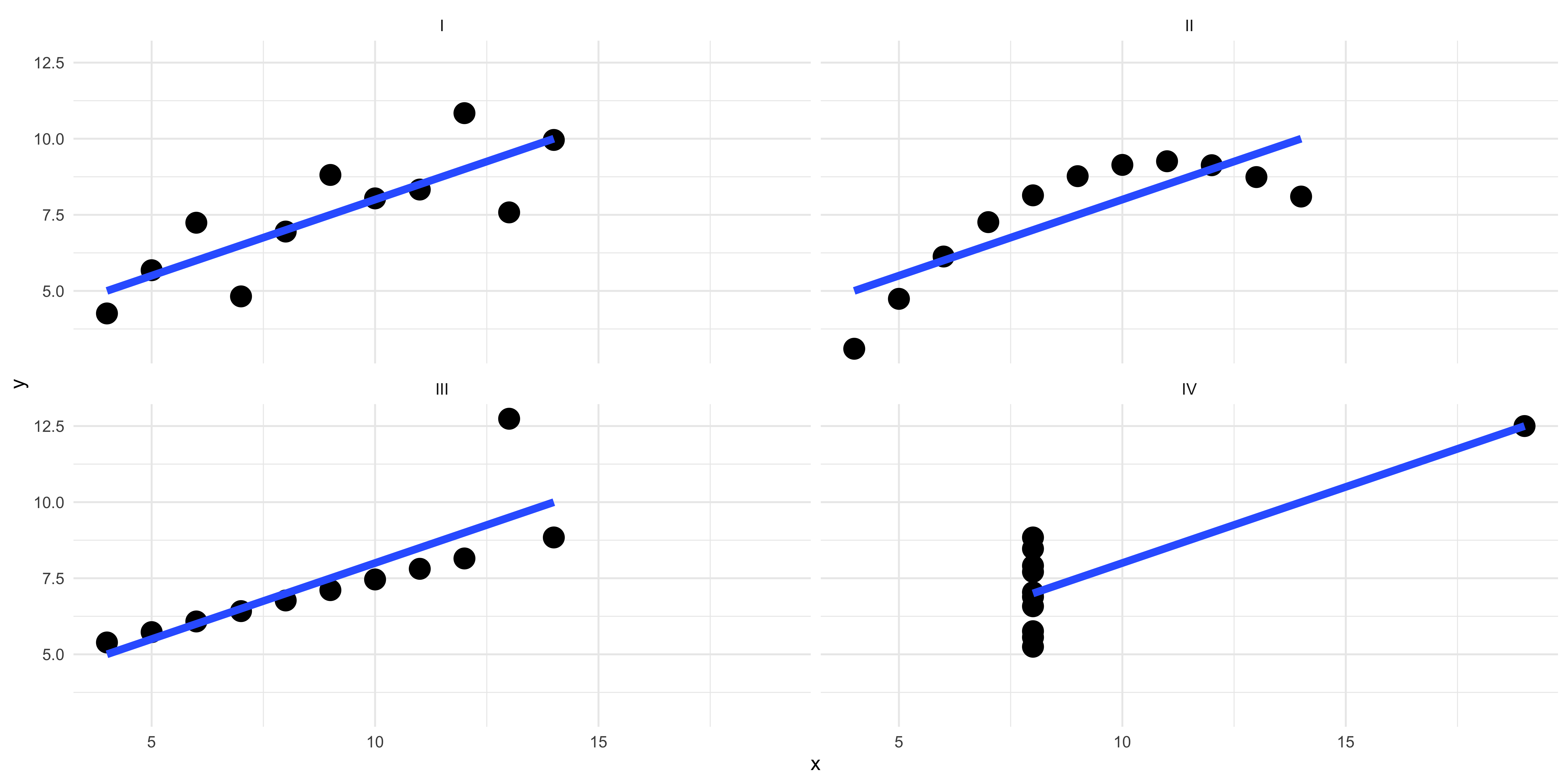
Figure 1: Anscombe's Quartet
ggplot
#
ggplot is a library in R that was designed on the basis of a book that was written in the 1990s called
The Grammar of Graphics, thus the “gg” in ggplot. It is the standard library for figure creation in R and is what we are going to be using here. There are also other libraries that have adopted the ggplot conventions and applied them to other kinds of figures not covered in the original package like ggtree for phylogenetic plots, ggnet for network data, and ggridges for ridge plots.
There is a grammar to ggplot that once you acquire will allow you to make all sorts of compelling and visually parsimonious plots. The basic setups are thus:
- Call the
ggplotfunction and feed it data in thedataargument, where the “data” in the following example is a data frame with all the data you want to plot.
ggplot(data = dataframe)
- Tell
ggplotwhat you want mapped to aesthetic properties of the plot with theaesargument. At a minimum you will likely want to give the aesthetic mapping both an “x” and a “y” value (a column in the data frame) to the respective axis of the plot. This isn’t the case if you are making a histogram or density plot but we will cover that shortly. This defines the basic structure of the plot and you can then layer on additional properties.
ggplot(data = dataframe, aes(x = Variable_X, y = Variable_Y))
- Call a
geomwhich defines the kind of plot you want to make. For example a line plot is made withgeom_line, a histogram withgeom_histogram, a scatter plot withgeom_point, and a bar plot withgeom_bar. You “add”geomsto the base plot that you defined in step two using a literal addition symbol (+) at the end of the line where the base plot is defined.
ggplot(data = dataframe, aes(x = Variable_X, y = Variable_Y)) + geom_line()
That is the fundamental structure of any plot or figure you can make with ggplot and there is a lot more complexity to add using different geoms and aesthetic mappings that we will cover shortly. And we will start that by actually creating some plots to learn by doing.
Distributions #
When we start to look at our data by visualizing it we often want to know the distribution of values that the data takes. We usually do this with histograms, to count the number of times a given value appears. We are going to use some data from the Chicago Transit Authority to demonstrate this. The CTA dataset has information about all the “L” Stations in Chicago and the number of “daily entries”, the number of times people swiped their metro cards to board the trains.
Here we will use the grammar we learned above to start building a plot, by calling ggplot telling it what data we want to use, and providing an aesthetic mapping for the X and Y axes and calling a geom to create the plot. In this case we are going to be using the geom_histogram function to create a histogram. Because a histogram only counts the values in a single variable at a time, when we tell ggplot an aesthetic mapping with the aes function we only give it an X axis variable.
ggplot(data = cta_rides, aes(x = rides)) + geom_histogram()
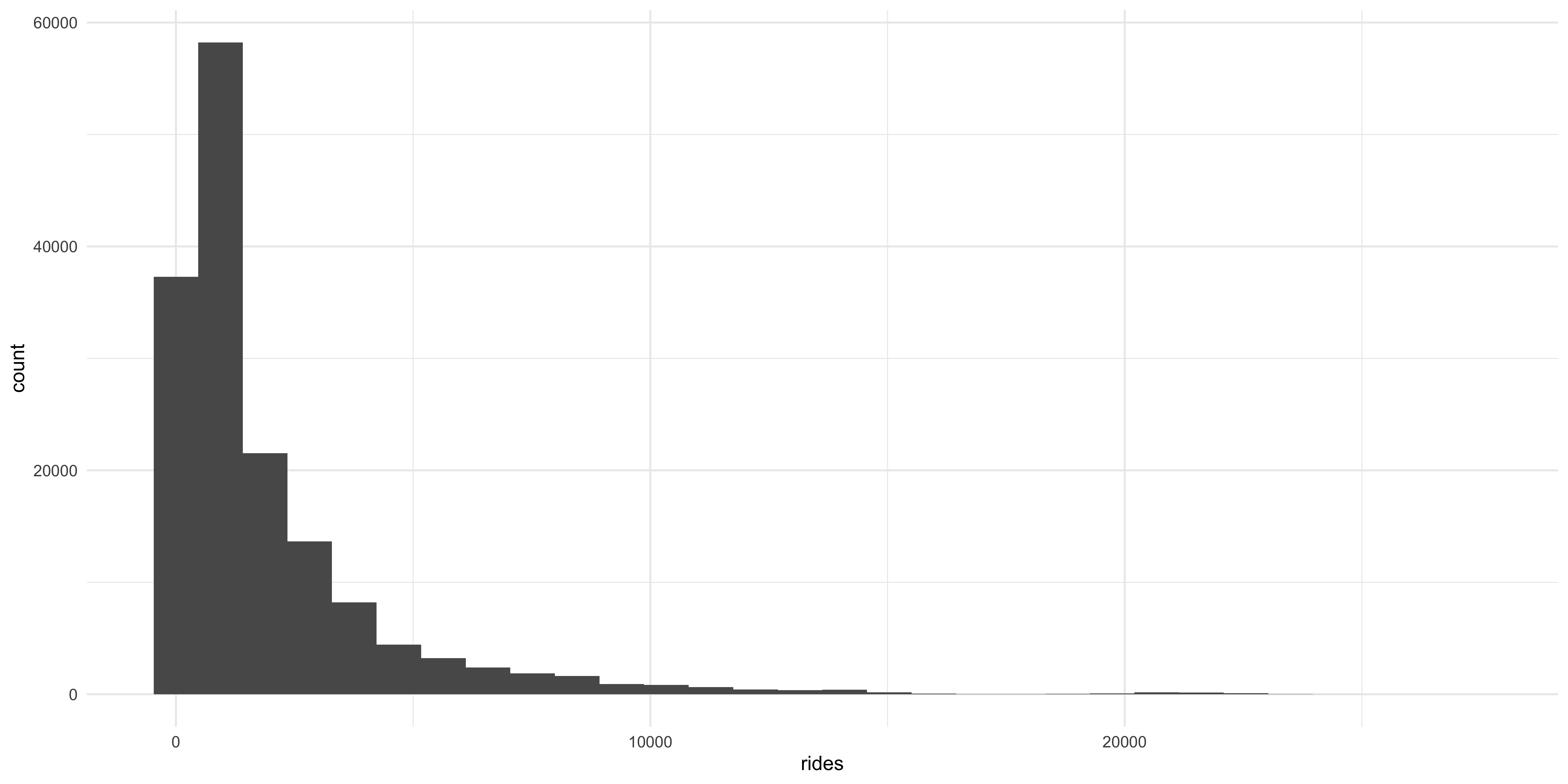
A histogram gives some immediate information about the distribution of daily rides across all the stations in the dataset: in this case it shows that daily ridership across the stations is highly positively skewed, with most stations falling on the left side of the X axis with a very long sparse right tail. But there are some issues with this plot: each bar represents a different “bin” with the height corresponding to the number of times that value appears in the data. The bins are a uniform color so it is hard to tell them apart. Also, the axes are hard to read.
ggplot(data = cta_rides, aes(x = rides)) +
  geom_histogram(fill = "dodgerblue", color = "black", alpha = 0.5) +
  theme(text = element_text(size = 20))
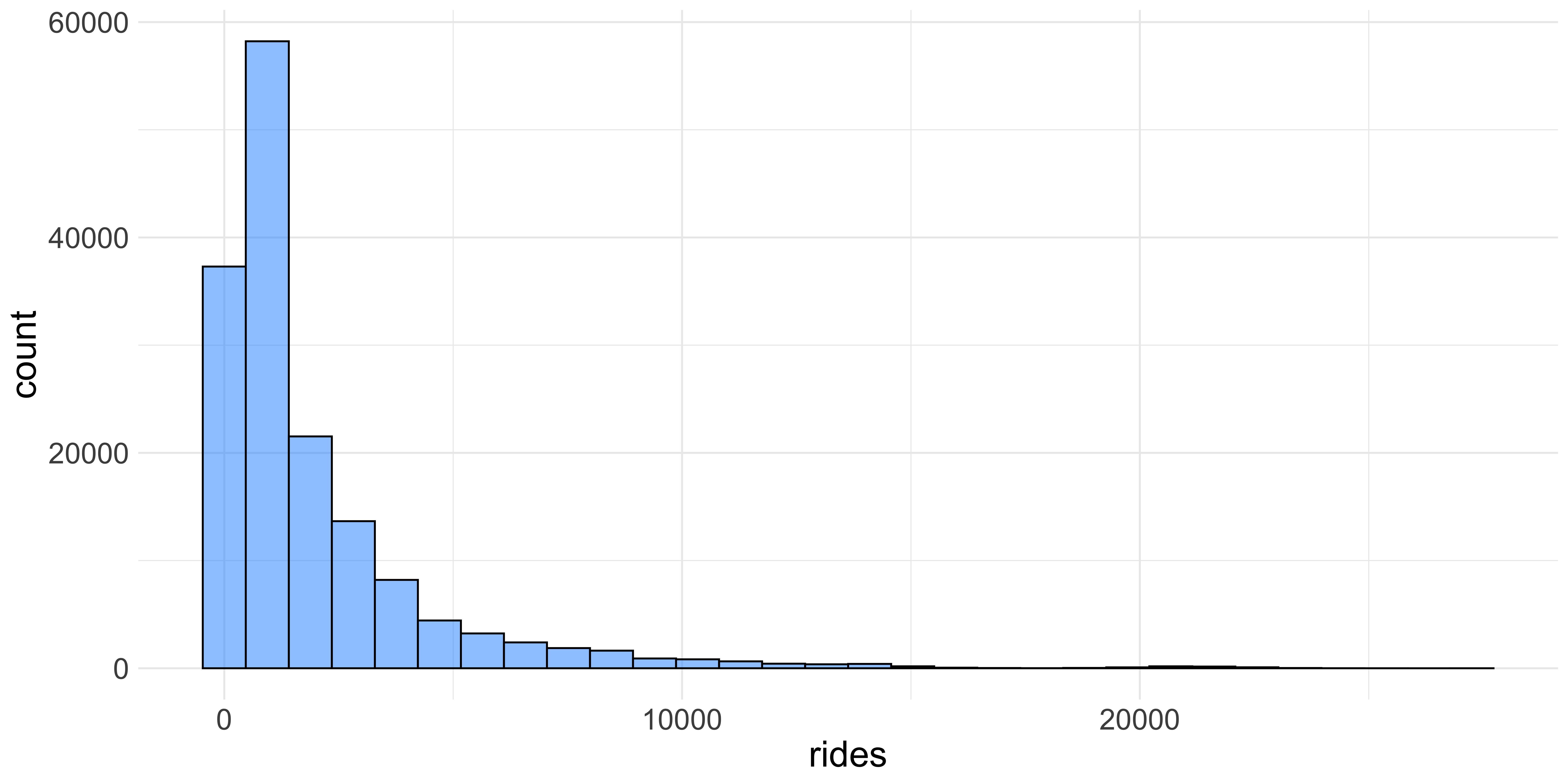
We can change the colors of the bars and the size of the axis labels by specifying a few more arguments in ggplot We can increase the text size with the theme function as well as adding color arguments to the geom_histogram function. The fill and color arguments refer to the inside color of the bars and the outline of them respectively. The alpha changes the opacity of the bars which also makes it a little nicer to look at.
Themes The visualizations you see here might look slightly different than ones you make unless you provide an extra “theme” layer to yourggplot. Themes are ways of changing the visual properties of your plots; for instance the base theme forggplothas a rather unattractive grey background. Overall I think that the “minimal” theme is superior and you can use it by addingtheme_minimal()to your plot.
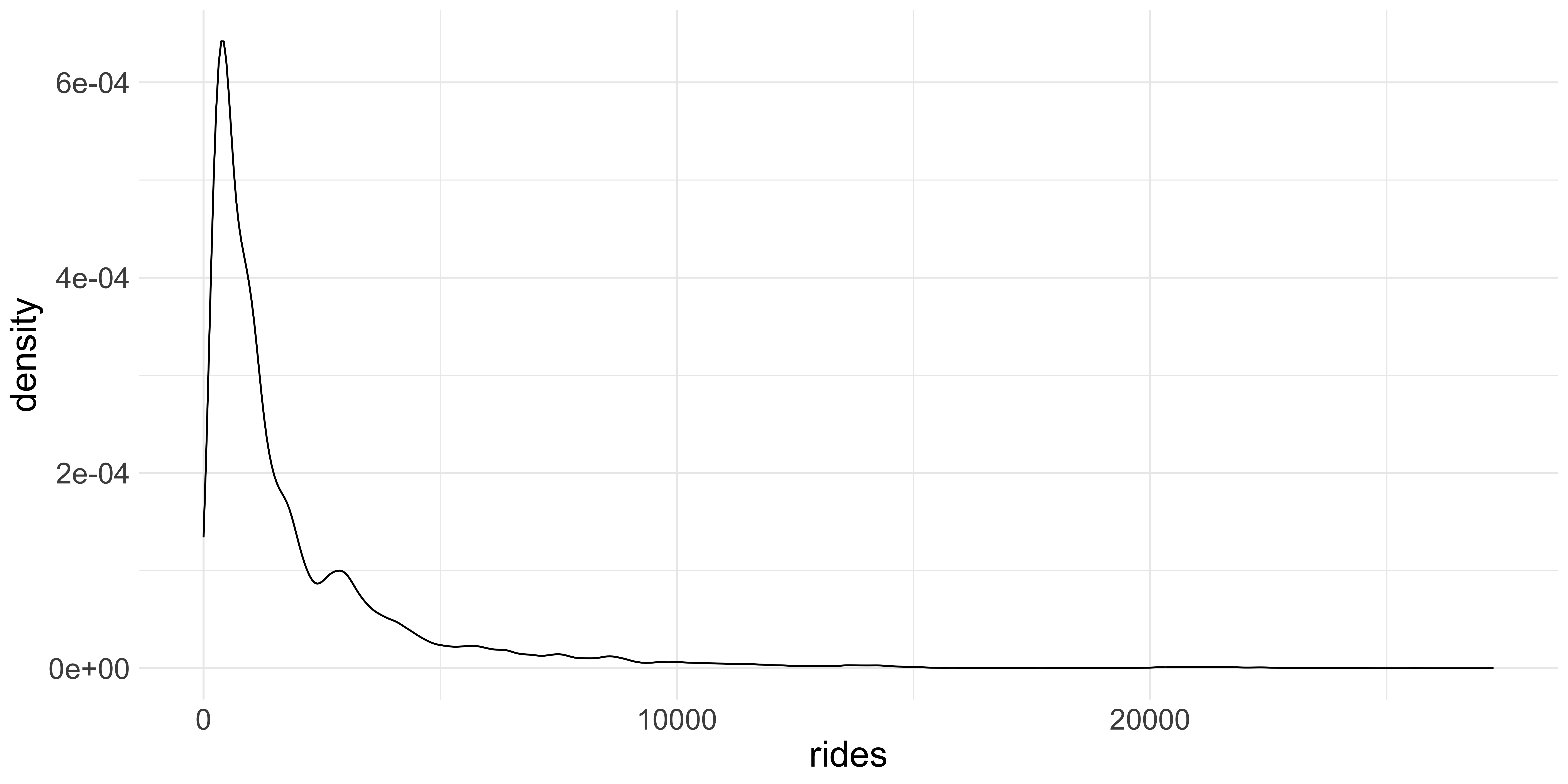
Another way of visualizing distributions is by using the geom_density function which uses a
kernel density estimate to produce a smooth curve over the observed frequencies of values in the dataset.
Kernel Density Estimation: The kernel density plot is a way to estimate the probability density function of a continuous random variable. It smooths the data points to create a continuous curve. In a density plot, the total area under the curve is equal to 1 and the area under any segment of the curve represents the proportion of the data points that fall within that segment. Visualizing distributions this way helps you “see” the morphology of the data better.
ggplot(data = cta_rides, aes(x = rides)) + geom_density() +
  theme(text = element_text(size = 20))
Trends Over Time #
One of the primary things we want to look at, particularly with longitudinal data, is what happens as time goes by. To demonstrate this we will be looking at ridership by station. Considering that there are more than 100 stations in the dataset, we are going to only look at the top 20 stations by mean monthly ridership. One thing we are going to be looking at is how the pandemic influenced ridership, which as you might imagine, was quite dramatic. To do this we need to do some data transformation.
First, we need to find out which stations have the most ridership. To do this we take the data frame, which has a row for every station for every day there is data, and columns for the station name, date, and ridership, and extract the year from the date column, group by the station and the year in which the observation occurs, before calculating the mean and standard deviation for each.
summary_df <- cta_rides %>%
  mutate(year = str_extract(date, "\\d{4}")) %>%
  group_by(stationname, year) %>%
  summarise(mean_annual = sum(rides) / 12,
            sd_annual = sd(rides)) %>%
  ungroup()
Now we grab the top 20 stations by the number of mean monthly riders before sub-setting the complete data frame to a smaller one to visualize. We then calculate a rolling mean so it is easier to visualize, otherwise the data would look very chaotic.
Helpful Hint In R you can arbitrarily break up code across lines to keep it “tidy”. The style conventions in R is to keep lines under 80 characters long, that way when you view them in a text editor, they are completely visible without scrolling horizontally.
Now we are ready to visualize the daily rate of ridership across the top 20 stations by mean monthly ridership over time. We can do this with a simple line plot, using the geom_line function in ggplot. In this first plot we are going to be mapping the rate of ridership (the column/variable monthly_average) to the Y axis and the day in which the observation occurred (date) to the X axis to show change in rates over time.
ggplot(data = station_roll_stats, aes(x = date, y = monthly_average)) +
  geom_line()
Figure 2: Something seems amiss here.
This is not as informative as we would have liked it to be because we are looking at daily ridership for 20 stations and all their value’s are getting mapped onto the same points, making the plot uninterpretable. What we need to do is use another aesthetic mapping to tell ggplot to group the rows of the data frame and plot them across the X axis as single lines. We can do this by adding the group argument to the aes function inside the call to ggplot
ggplot(data = station_roll_stats,
       aes(x = date, y = monthly_average, group = stationname)) +
  geom_line()
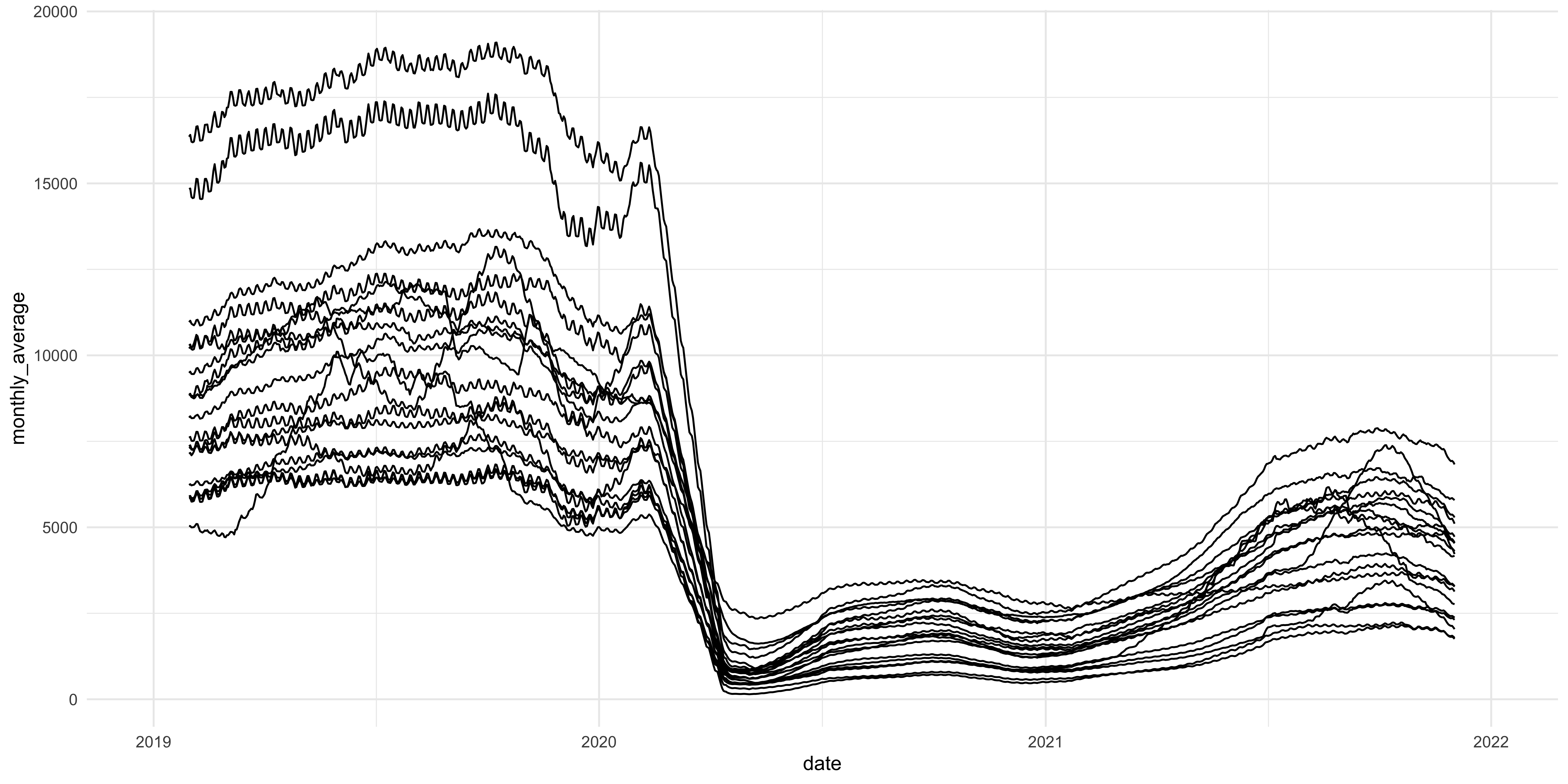
Figure 3: This looks better but still needs work
This figure is much better because it actually shows the stations’ change in rate of ridership over time. As you can see, in early 2020 there was a precipitous decline in ridership across the 20 stations we are looking at but the lines aren’t labeled in any way so we don’t know which stations are at which line. To do this we can use a the color aesthetic mapping to label the lines
ggplot(data = station_roll_stats,
       aes(x = date, y = monthly_average,
           group = stationname, color = stationname)) +
  geom_line()
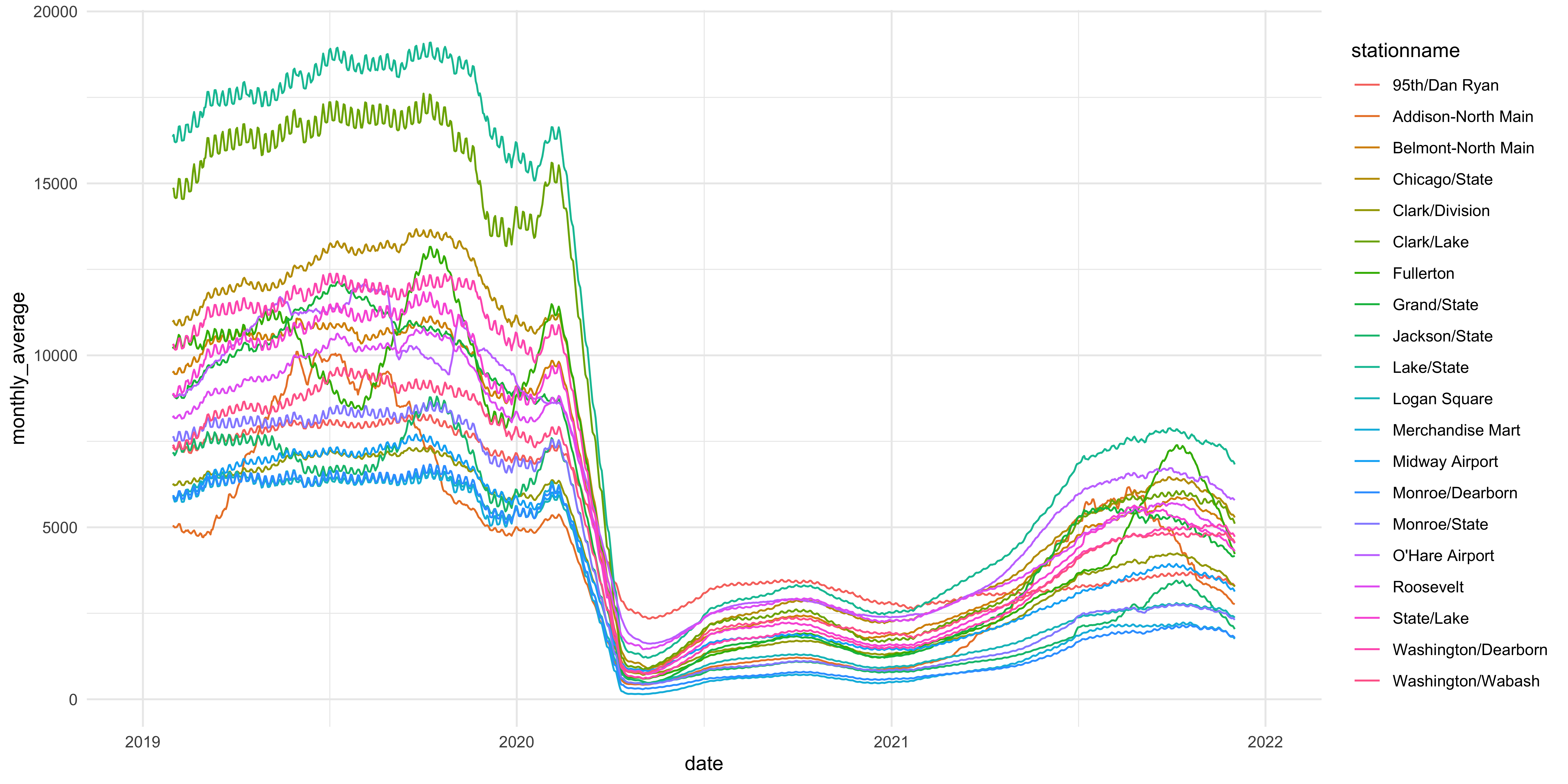
Figure 4: Now we can see who is who and what is what. Sort of.
ggplot(data = station_roll_stats,
       aes(x = date, y = monthly_average,
           group = stationname, color = stationname)) +
  geom_line() +
  labs(y = "Daily Ridership",
       x = "Year",
       title = "Daily CTA Ridership Over Time",
       color = "Station")
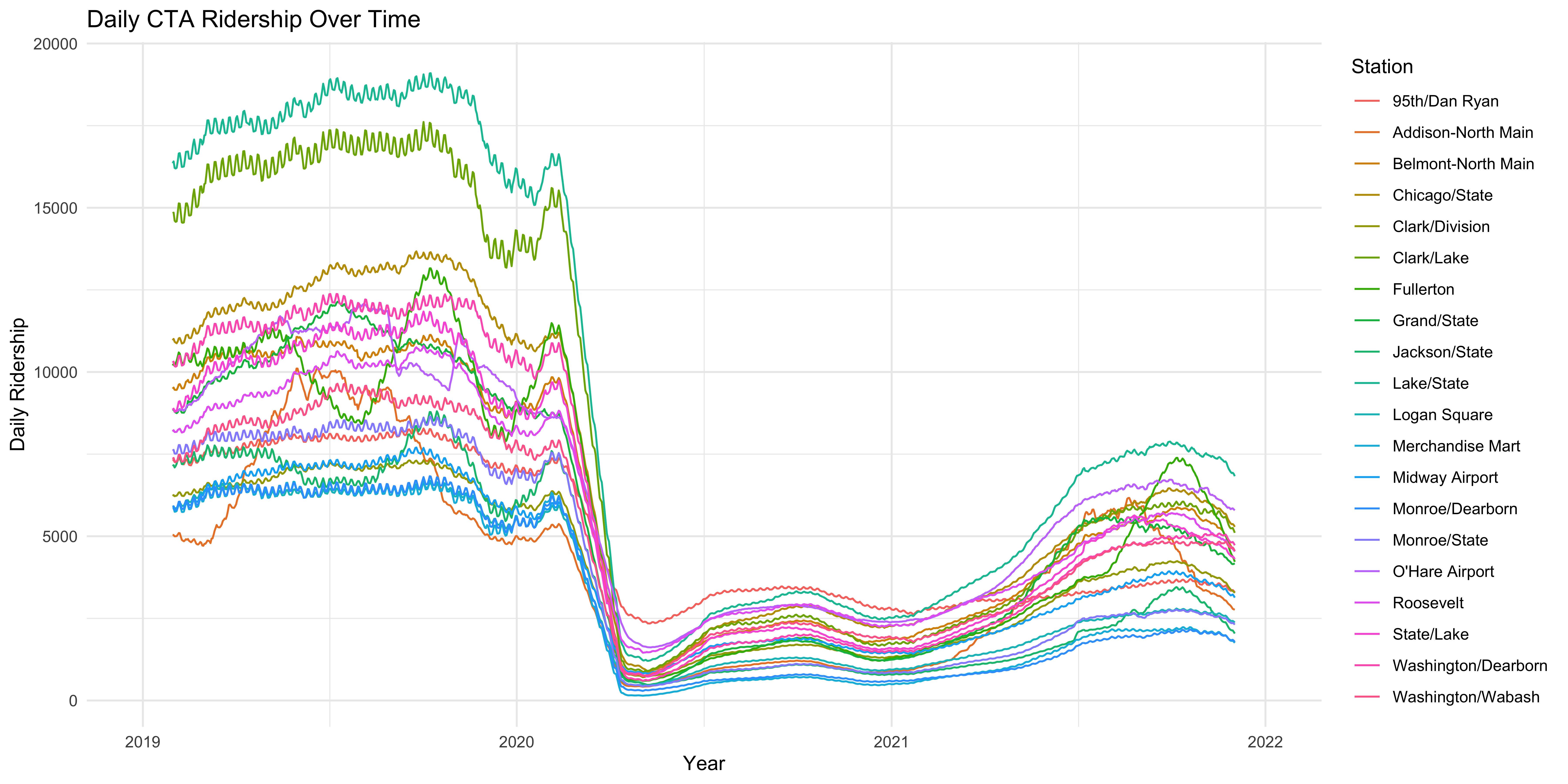
Figure 5: Properly labeled axes and a title help to make the figure more interpretable immediately to the reader.
That looks more like a real plot but we might want to actually take a look at the individual stations to see what is going on in each of them and see if there are any particularly surprising changes over time. As the figure stands above, that is somewhat obscured. We could do that by breaking up the data using filters and create one plot per station but that is tedious. Luckily, ggplot has another function that allows you to create a paneled figure, so that a single plot is made for each station. We do this by using the facet_wrap function.
facet_wrap
There is a tilde before the variable we are grouping the data by for the panelling. That essentially tells the function to “group by” that variable and plot the X and Y axis.
ggplot(data = station_roll_stats, aes(x = date, y = monthly_average)) +
  geom_line() +
  facet_wrap(~stationname) +
  labs(y = "Daily Ridership",
       x = "Year",
       title = "Daily CTA Ridership Over Time") +
  theme(axis.text.x = element_text(size = 10))
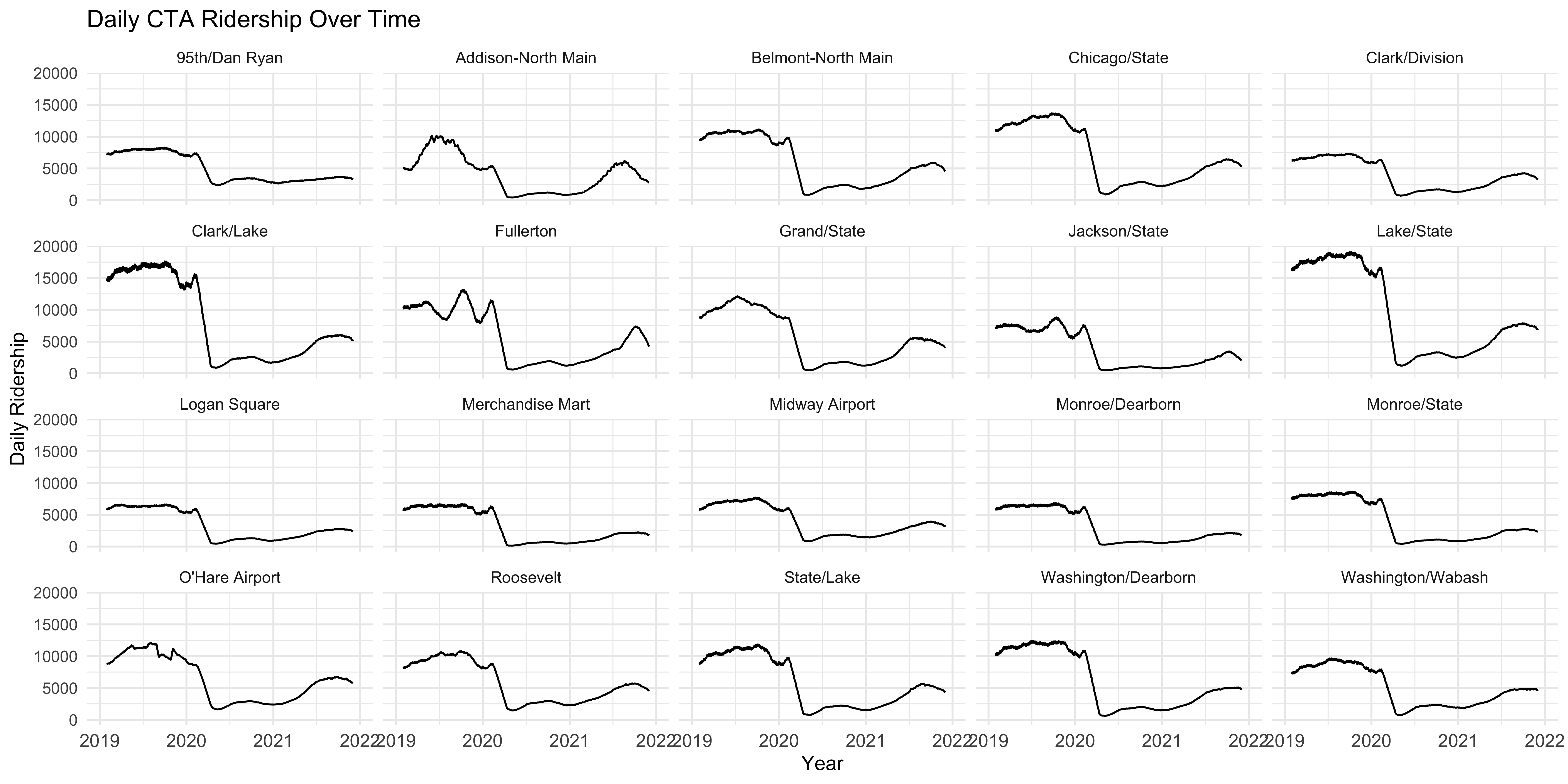 Now that helps to see how ridership rates vary over time for each station with a shared range of X and Y values so each individual plot is comparable. What more, each plot is labeled with the station it is displaying so each is clearly identifiable.
Variation by Group #
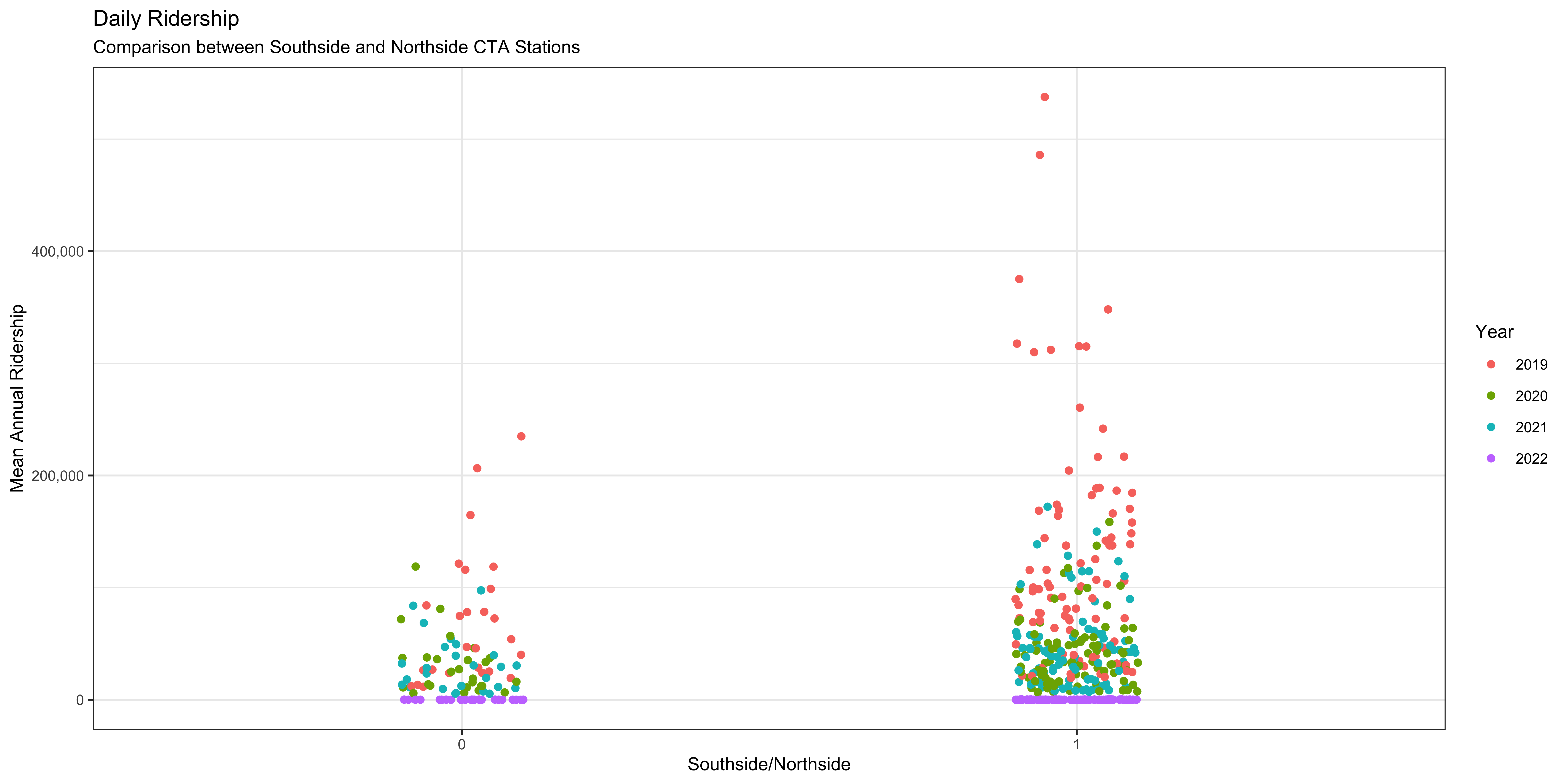
Another thing we will want to check out is the variation in the focal variable, the rate riders for each station by some categorical difference in those stations. One that immediately comes to mind is whether the station is located on Chicago’s North or Southsides. To do this we will want to check out the mean and variation of riders per station between stations on the north and south side. We can use a “box and whisker plot” to plot this. This kind of plot displays a few important statistics: the median, lower and upper quartile (the box), and the minimum and maximum (the whiskers). The ggplot does something slightly different in that it shows outliers as individual points so it isn’t strictly speaking using the minimum and maximum to the whiskers. We use the geom_boxplot function to do this after specifying the categorical variable in the X axis to plot the two groups and the same Y axis mapping as the plots above.
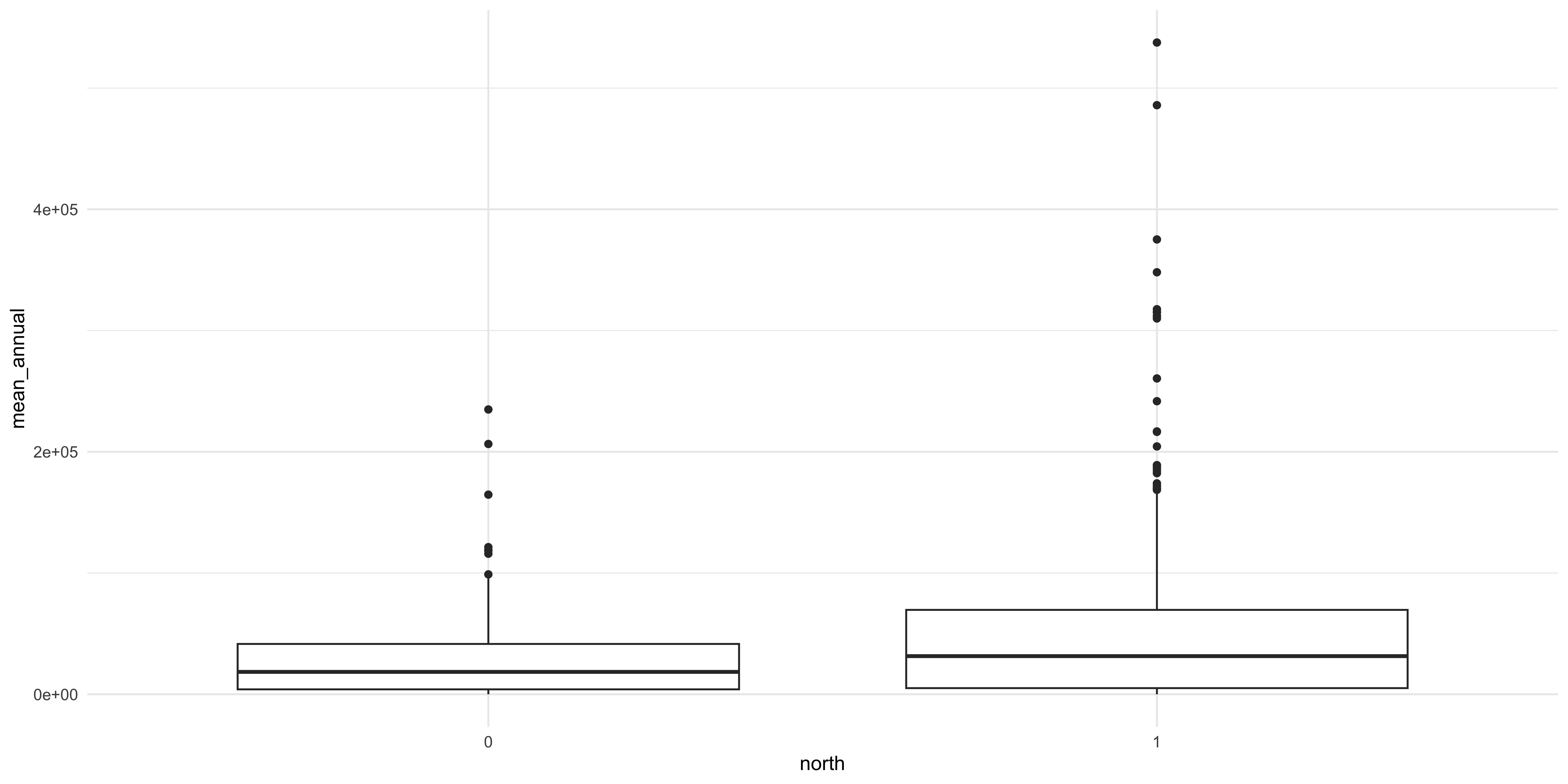
Figure 6: There does seem to be a difference but the relationship is obscured.
A few things should jump out to you: there does seem to be a difference between the two focal categories (North and Southside stations) but the amount of variance in the two is different. It is also important to note that we are pooling all the data across all the years observations occurred. Whether or not that is a defensible visualization strategy will be a matter of debate.
A principle that we are going to cover is that making a good figure helps you visualize where your data is. The box and whisker plot obscures where each data point actually is. So let’s use a different geom that is going to let us see where each data point is. To do that we use a different geom, geom_scatter, to make a scatter plot.
A scatter plot lets you see every data point but the categorical variable makes all the data points line up and we can’t see where every data point is. Considering that the X axis is a nominal variable and the specific position along that axis is not really meaningful we can “jitter” the points to let us see where they are along the Y axis. This is another geom that we can add to the plot which will randomly scramble the position along the X axis between a specific range.
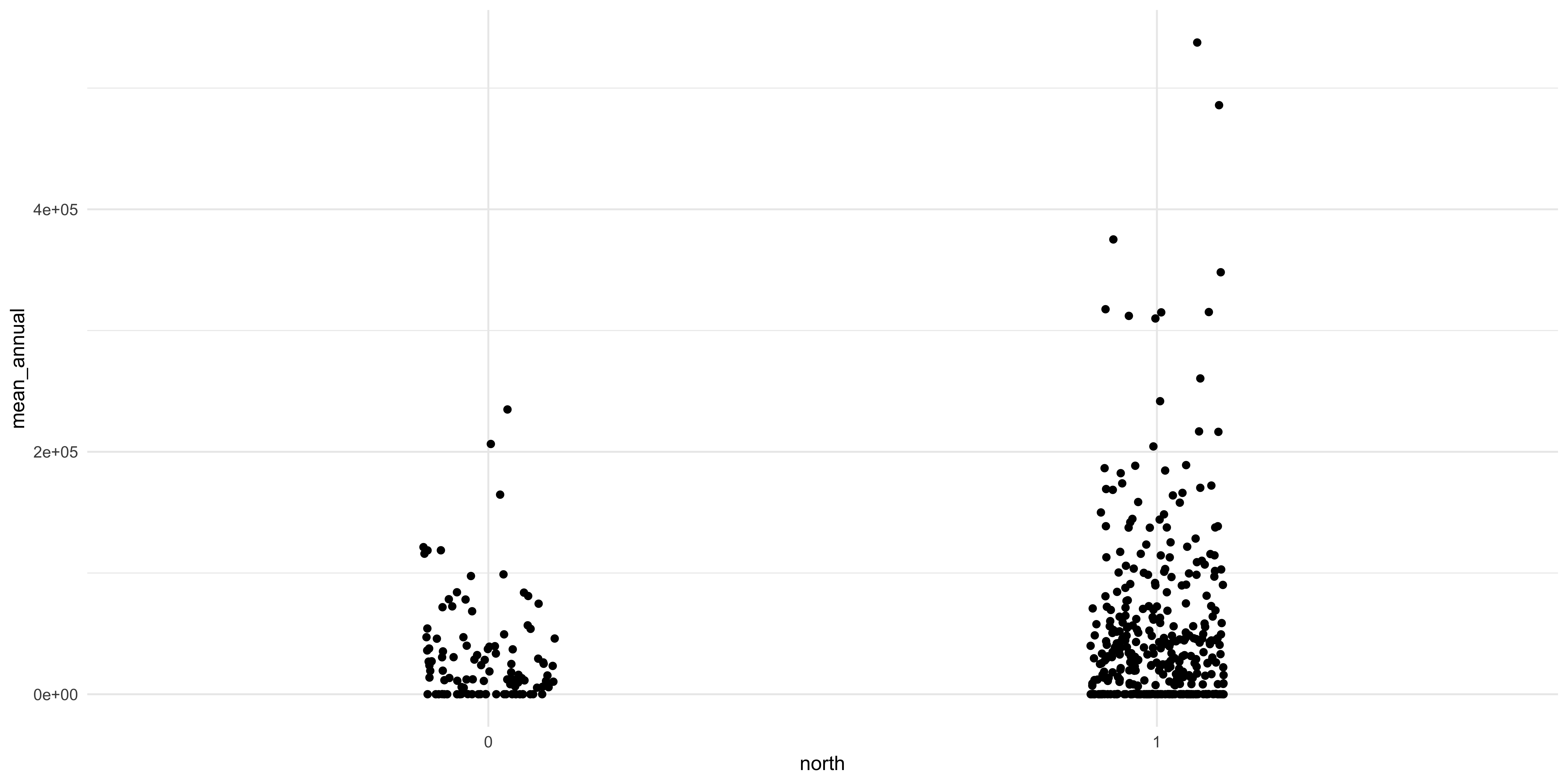
This looks much better and we can see some interesting things between the two sides of the city. There does seem to be a difference between the two groups: there seem to be more stations on the Northside and they have some of the highest ridership in the city. The relative differences in the number of observations between the two groups could be driving the observed relationship. I know that I am playing fast and loose here with the comparisons and that a conscientious social scientist, like you, would do a few tests before this visualization and after to interrogate the differences. But we are learning about figure creation so we want to make figures.
There is another variable in the dataset that we can use to help interrogate the differences between these two groups. We can color the individual points by which category they fall in to. To do this we add another argument, color, to the aesthetic function in the call to ggplot.
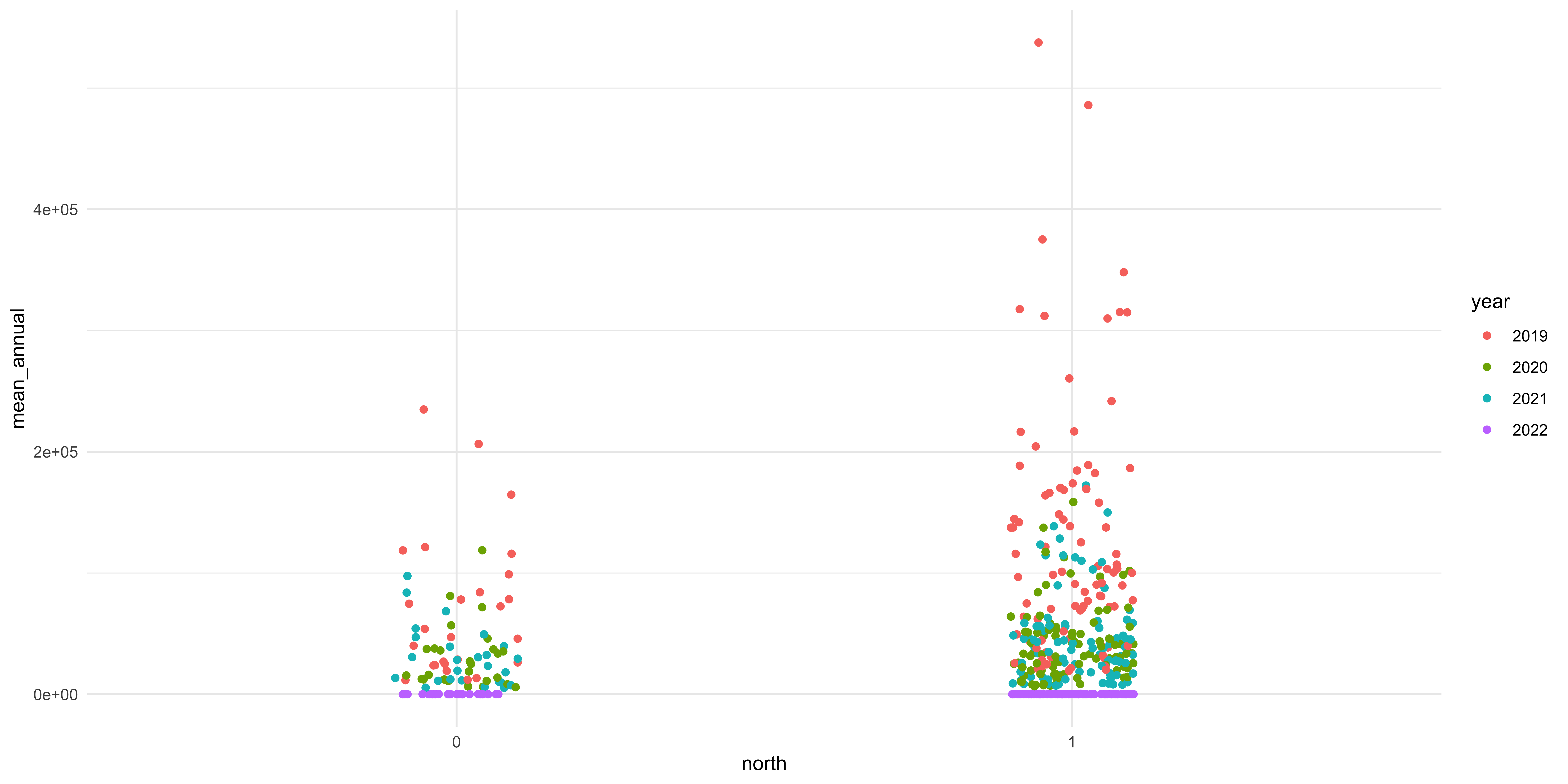
Figure 7: There are notable differences in terms of the two groups and the different categories of welfare state regimes.
We are going to add proper axis labels, a title, and legend title.
Comments for Code There is a convention in computer science to include “comments” in your code, prose style notes that annotate your code and make it clearer what you did and why. You indicate a comment in R by including a pound or hashtag (#) at the beginning of the line and the same for Python. It is important to include comments in your code for two reasons:
- Showing what you did: If you fully adopt an open science posture to your own research and writing you’ll probably disseminate a curated dataset and the source files that generate all your findings, including the RMarkdown file of your actual article. Providing informative comments to your code will make it clearer what you did and why to whomever is really interested in understanding what you did.
- Knowing what you did: The more important reason, or at least the reason that is going to be most useful to you, is that you need to know what YOU did. You are going to put the project down and go on vacation or work on other things and you’ll need to get back and know what you were doing. Most of the time, really nearly all the time, you are the only one who needs to know what was happening in your document and so write comments knowing what you’ll need to know in the future.
Rendering document #
Once you have written your document and are ready to compile it to a format for distribution you will have to run a little R code. You can do this either from an R session or from the terminal in the directory that has your document in it. From an R session you would run rmarkdown::render('draft.Rmd') and from the terminal Rscript -e "rmarkdown::render('draft.Rmd')".